Triage Tag Mobile App Style Guide

Project Scope
Design a mobile application which will digitize and streamline first aid triage tags. Specific attention must be paid to simplify and expedite user flows. A bare minimum number of screens should be designated as required, with the remainder being skippable at the user’s discretion. Large hit areas, high visibility and low content density should serve as the guiding design principles. The goal is to provide first responders with a quick, easy to use data entry system, while granting remote supervisors access to current patient information in real time.

The Inspiration
Existing triage tags and patient intake forms served as the primary inspiration for the visual aesthetic of this project. Established norms such as color coding conventions and iconography were incorporated into the mobile app as much as possible. Simple, neutral colors and large font sizes served as the foundation of the project. A limited number of highlights colors were used to accent specific areas as needed. Design clarity (rather than subtlety or elegance) remained the top priority throughout the project.

Personal Note
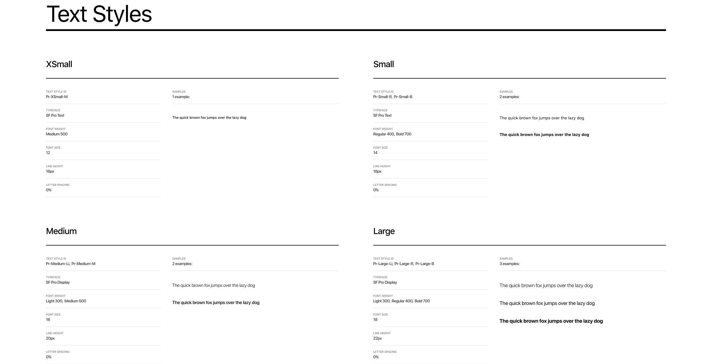
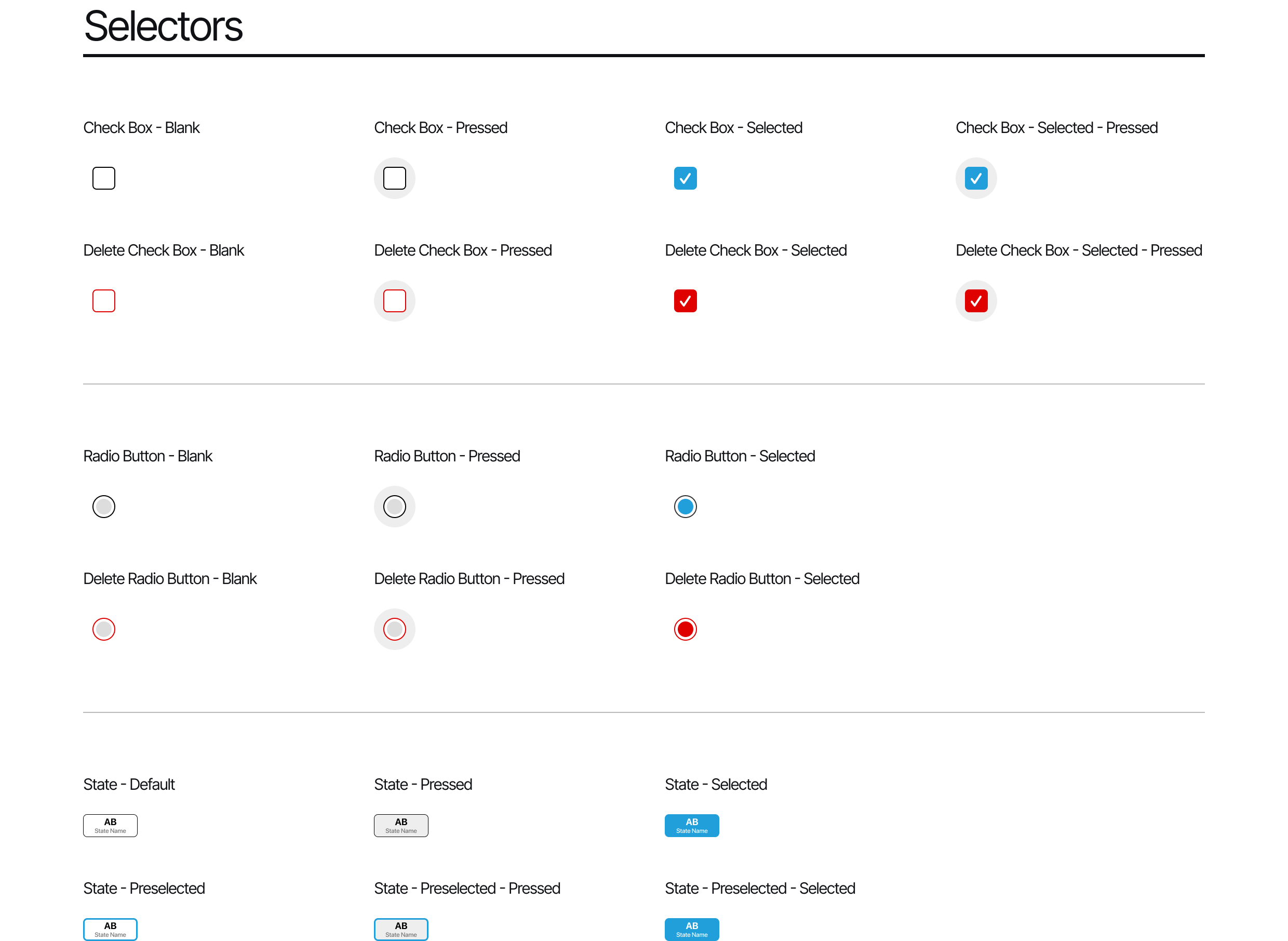
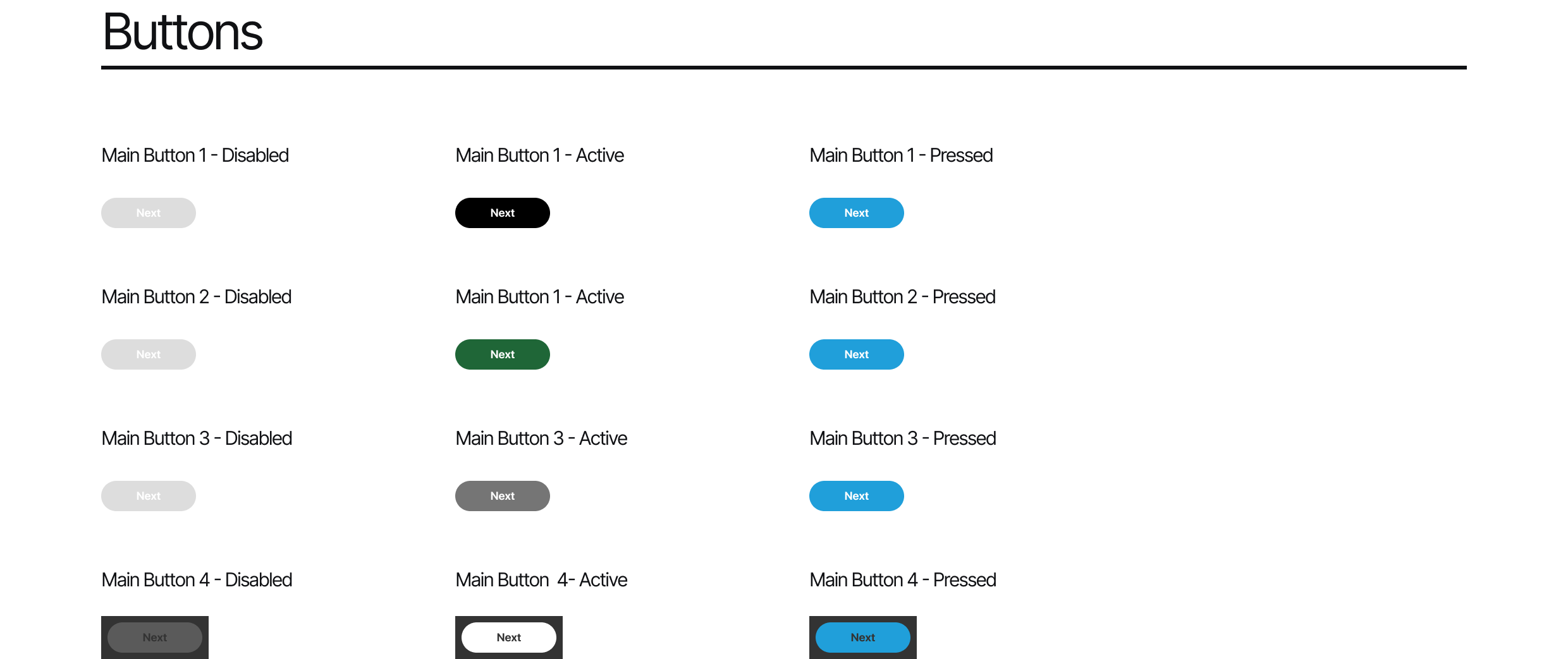
Due to disclosure limitations I am not able to share final app screens. I am however able to provide a behind-the-scenes look at the style guide included in the developer handover. Style guides are a standard part of every UI project, although they rarely get published. These are the basic building blocks used to develop your design system and turn your ideas into blueprints.

Triage Tag Mobile App Style Guide


